|
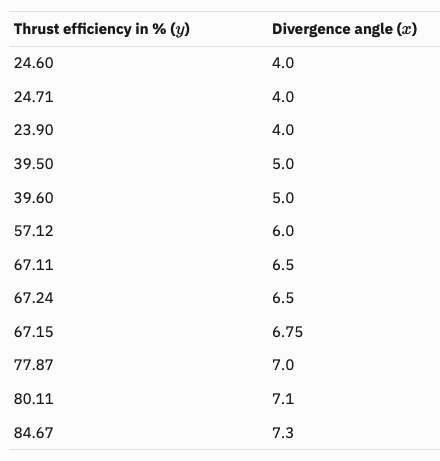
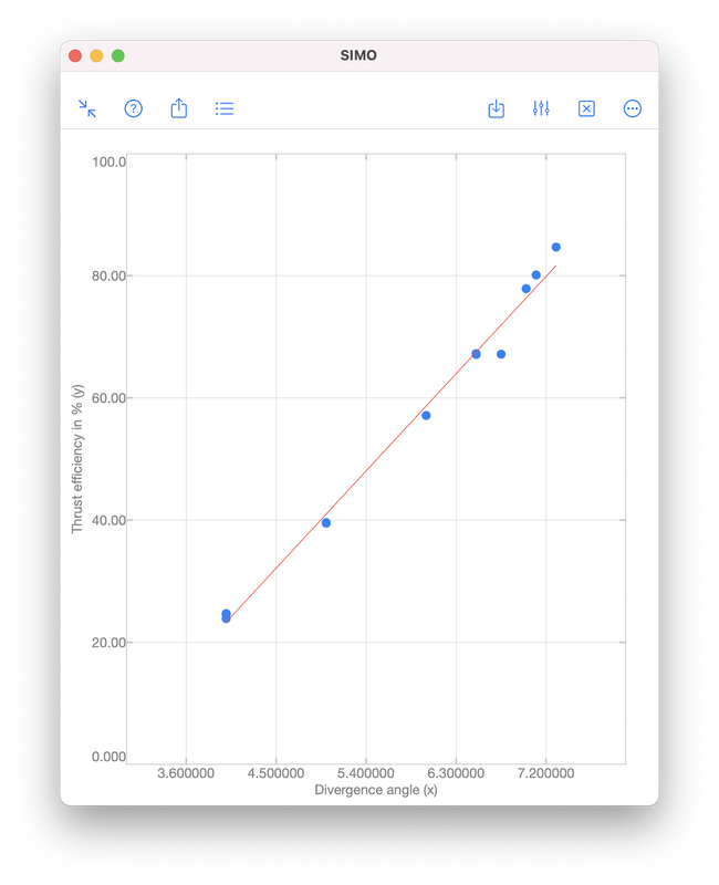
Polynomial regression is a technique to model the dependence of data collected in an experiment. The dependence is represented by a polynomial: $$f(x)=a_0x^{n}+a_1x^{n-1}+\cdots+a_{n-1}x+a_n,$$ where \(x\) is a real number. The integer \(n\geq 0\) is called the order of the polynomial, which is defined as the highest power among the terms with non-zero coefficient. For examples, $$-5,\quad x+1,\quad 2x^3+x^2+1$$ are zeroth (\(n=0\)), first (\(n=1\)) and third (\(n=3\)) order polynomials, respectively. Note that \(0\cdot x^2+x+1\) is a first order polynomial since the first term has zero coefficient. Illustrative ExampleTo illustrate the idea of polynomial regression, we consider data collected during an experiment to determine the change in thrust efficiency (in percent) as the divergence angle of a rocket nozzle changes (see [1], p. 530):
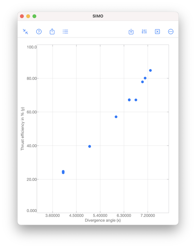
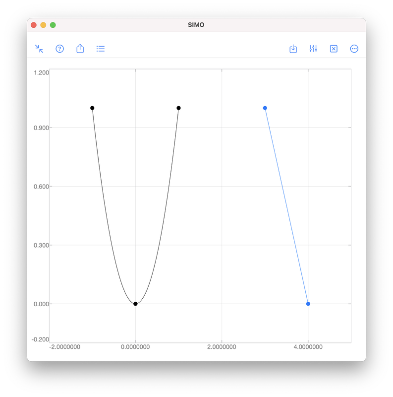
Let \((x_i,y_i)\) be a given data point for \(i=1,2,\ldots,N\). We want to find a polynomial \(f\), such that \(y_i\approx f(x_i)\) for all \(i\). InterpolationInterpolation requires the polynomial passing through all given data points, i.e., \(y_i=f(x_i)\) for all \(i\). However, this often requires a high order polynomial because the order grows with the number of data points:
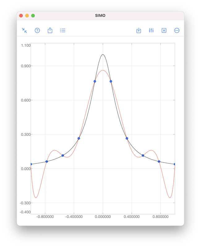
In this above figure, the blue dots represent samples of the black curve. There are in total 10 points and hence interpolation requires a 9th order polynomial, as shown by the red curve. We see that the red curve is oscillatory while the original curve (black) is not. RegressionAs we have seen, it is sometimes undesirable to force a polynomial to strictly pass through all data points. A better approach is to look for a polynomial that is "good enough". That means, we find a polynomial such that the error $$e=\sqrt{\sum_{i=1}^N\left[y_i-f(x_i)\right]^2}$$ is minimised. Obviously, for interpolation, the error is zero. When interpolation is undesirable, we will accept a non-zero but minimised error \(e\). To perform polynomial regression:
The coefficients \(a_0,a_1,\ldots,a_n\) in Step 2 can be obtained by solving a least square problem using QR decomposition. A brief description can be found in the document page of polyfit included in SIMO or Console. The coefficients can be obtained by SIMO or Console using the function polyfit, as shown below.
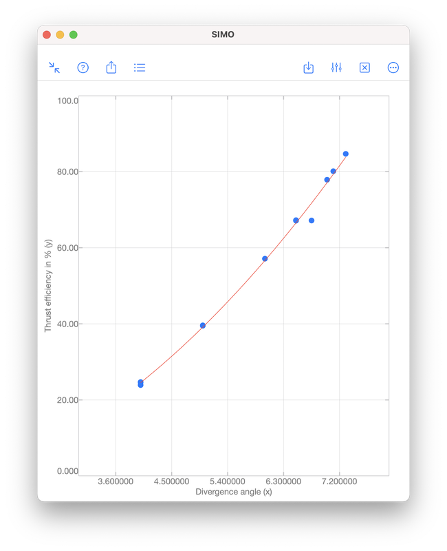
The output coefficients are 17.680815 and -47.420696. Therefore, the polynomial obtained is $$f(x)=17.680815x-47.420696.$$ The error \(e\) is given by S.normr, which is 6.9987482. As shown below, the error can be improved to 4.971942 by using a second order polynomial $$f(x)=1.4670472x^2+1.3837119x-4.4594937.$$ For the meanings of s.R and s.df, please see the document page of polyfit included in the apps.
That is it for the post. If you have any question, feel free to leave comments. Thanks. References[1] Montgomery Runger Hubele, Engineering Statistics, 5th edition, Wiley, 2011.
[2] Gene H. Golub and Charles F. Van Loan, Matrix Computations, 4th edition, The Johns Hopkins University Press, 2013.
1 Comment
Linear regression is commonly used to model the relationship between two variables, for example, the size of an apartment and its electrical energy consumption. Another example is the current drawn in a magnetic winding and the supply voltage [1]. Here, the independent variable is the supply voltage \(x\), whereas the dependent variable is the current \(y\). Values of \(x\) and \(y\) measured in 10 tests are given in the table and scatter plot below. 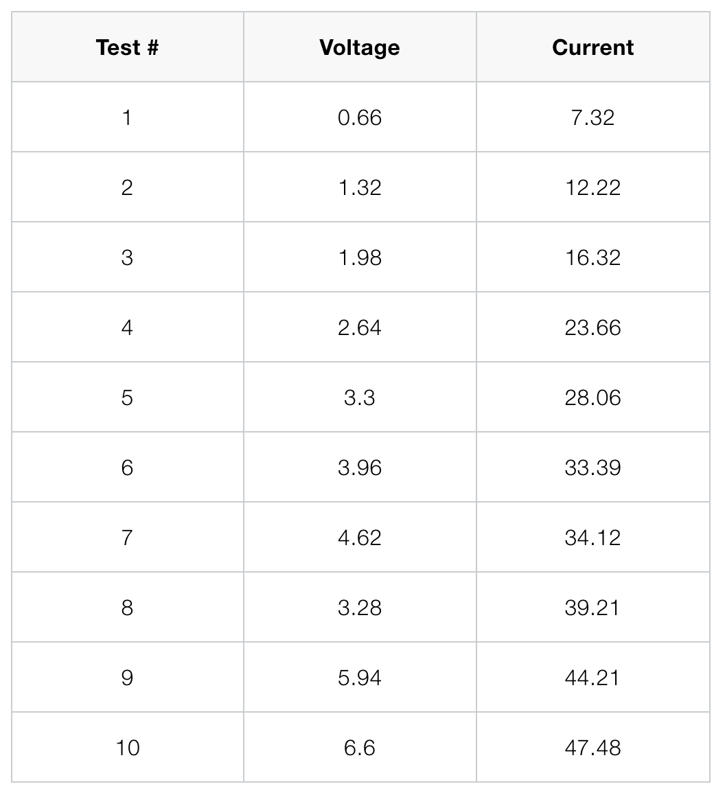 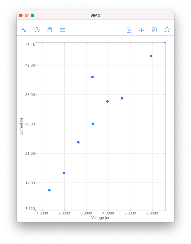 As we can see from the scatter plot above, the data \((x,y)\) tend to fall along a line with positive slope. This might suggest that \(x\) and \(y\) are somewhat linearly correlated. However, we have to be careful when making such an assumption. The validity of the assumption is always doubtful, unless we have conducted analyses to establish the adequacy of the linear model. Analyses can be performed using the function corrcoef in SIMO or Console. This is explained in the following section. Correlation Coefficient Correlation coefficient is used to measure the linear relationship between two variables. For the variables \(x\) and \(y\), their correlation coefficient is defined as $$\rho_{xy}=\frac{\sigma_{xy}}{\sigma_y\sigma_x},$$ where \(\sigma_{xy}\) is the covariance, and \(\sigma_x\) and \(\sigma_y\) are the standard deviations of \(x\) and \(y \), respectively.
Input
Output
The value in R(1,2) gives the sample correlation coefficient \(r_{xy}\approx 0.9479\). Since \(x\) and \(y\) are real numbers, the matrix R is symmetrical. If \(x\) or \(y\) was complex, R(1,2) would be a complex conjugate of R(2,1).
Hypothesis Testing Now, we perform further analysis to confirm that \(x\) and \(y\) are indeed linearly correlated. We test the null hypothesis \(H_0:\rho_{xy}=0\) against \(H_1:\rho_{xy}\neq 0\). The null hypothesis \(H_0\) suggests that \(x\) and \(y\) are uncorrelated, whereas the alternative hypothesis \(H_1\) suggests that they are somewhat linearly correlated. The null hypothesis \(H_0\) can be rejected if the \(p\)-value is less than a given significant level \(\alpha\). A low \(p\)-value suggests that observing the null hypothesis \(H_0\) is unlikely. The \(p\)-value for \(\alpha=0.05\) is given by P(2,1), which is almost zero. This suggests that it is extremely unlikely that \(x\) and \(y\) are uncorrelated. If \(\alpha\) is not specified in the input argument, the default value \(\alpha=0.05\) is used. To specify a custom \(\alpha\), say, 0.1, use corrcoef(x,y,'alpha',0.1). Confidence Interval Finally, we obtain the \((1-\alpha)\%\) confidence interval of \(\rho_{xy}\) with the default \(\alpha=0.05\). This is given by RL(2,1) and RU(2,1) in the above example. As a result, we conclude that $$0.7895\leq\rho_{xy}\leq 0.9879.$$ 😎 To know more about the topic and usage of corrcoef, check out the document pages in our apps. Thanks. 😎 References [1] Douglas Montgomery and George Ringer, Applied Statistics and Probability for Engineers, 6th edition, Wiley, 2014. Today is Valentine's Day. So, we are going to draw some hearts, and then send them all to our lovers. Of course, we are going to do it by coding and math. This is what we are going to accomplish today:  Sending many hearts to your lover. The outline of a heart is a path of points \((x,y)\), which are given by the following parametric equations: $$ \begin{align} x&=x_c+16\sin(t)^3,\\ y&=y_c+13\cos(t)-5\cos(2t)\\ &\quad\quad\quad-2\cos(3t)-\cos(4t), \end{align} $$ for \(-\pi\leq t\leq \pi\). Here, \((x_c,y_c)\) is the center of the heart. You can change the location of the heart by changing \((x_c,y_c)\). We implement the above parametric equations in SIMO or Console as a function like the following one: aheart.m
Now, you can run the function above with center \((0,0)\) to produce the following heart. This heart has only 30 path points, and therefore is not very smooth. You can make it smoother by increasing the number of path points. 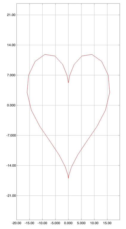 A heart centered as (0,0). Next, we need to duplicate this heart many times with different centers \((x_c,y_c)\). The centers are in fact path points on a bigger heart. The first part of the following code generates path points of the bigger heart. We need to scale it up 10 times bigger than the normal heart. These path points will serve as the centers of the smaller hearts, which will be drawn in the for-loop. It loops through each of the path points of the bigger hearts, and each of them is the center point of a smaller heart. manyhearts.m
If you run the above script, you will get the following:. 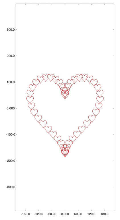 Many hearts Finally, you can save the plot as an image using the export feature of the app. Then, you can find the saved picture in the Photos app on your iPhone or iPad. You may want to do some editing like cropping and filters. Finally, you can send it to your lover! Happy Valentine's Day!  Crop the image and then send it to your lover! The Chinese community is celebrating the Chinese New Year in this week. Each year of the Chinese calendar is associated with a particular animal. This year is the Pig. To celebrate the new year and to brush up our programming/math skill, let us draw a few pigs by code. The pigs we are going to draw actually consist of some ellipses and parabolas. In case you forget, an ellipse is basically a flattened circle like this one.
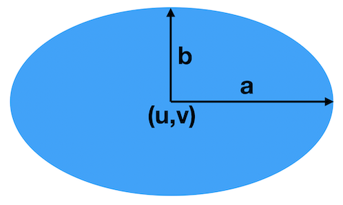
This ellipse has the center \((u,v)\), width \(a\), and height \(b\). For a general ellipse, \(a\) is not necessarily equal to \(b\). However, when \(a=b\), we call it a circle and \(a\) the radius. An ellipse can be represented by the equation: $$ \frac{(x-u)^2}{a^2}+\frac{(y-v)^2}{b^2}=1. $$ We can also use parametric equations to represent an ellipse: $$ \begin{align} x&=u+a\cos(t),\\ y&=v+b\cos(t),\quad 0\leq t\leq 2\pi. \end{align} $$ The parametric form is actually more convenient for plotting since it gives the \((x,y)\) point lying on the ellipse. Each \((x,y)\) point is associated with the parameter \(t\). Here, \(t\) goes from 0 to 180 degrees (i.e., 0 to \(2\pi\) in radians) and it means the full ellipse. If we just want to plot part of the ellipse, we can use other different intervals of \(t\). The following function draws an ellipse with given center \((u,v)\), width \(a\), height \(b\), and line color. ellipse.m: Draw an ellipse with given center, width, height, and line color.
Then, we can plot an ellipse with center \((u,v)=(0,1)\), width \(a=5\), height \(b=6\), and red line, as shown in the following. Drawing an ellipse with center (0,1), width 5 and height 6.
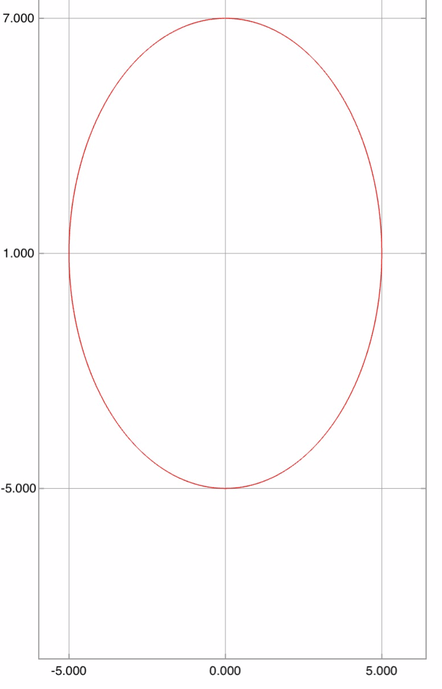 An ellipse with center (0,1), width 5 and height 6. Our pigs consist of several ellipses, which represent the body, head, eyes, eye balls, nose, and nostrils. The mouth and ears are shifted and scaled parabolas. Finally, the tail is simply a cosine curve. The whole construction of a single pig with center \((x_c,y_c)\) is shown in the following function. pig.m: Draw a pig, with center and line color.
For example, we can use the function to draw a pig centered at \((x,y)=(2,3)\). The result is shown below. Drawing a pig with center (2,3)
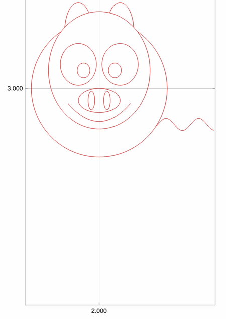 A pig with center (2,3). Finally, we want to plot 4 pigs with centers \((0,0)\), \((35,0)\), \((35,30)\), \((0,30)\). This can be done using the script below. And, finally, we have 4 cute pigs to celebrate the new year! draw.m: Drawing pigs, one by one.
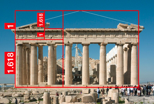
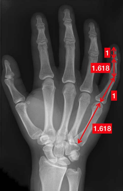
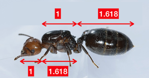
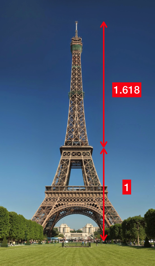
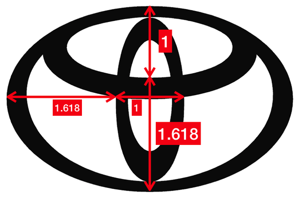
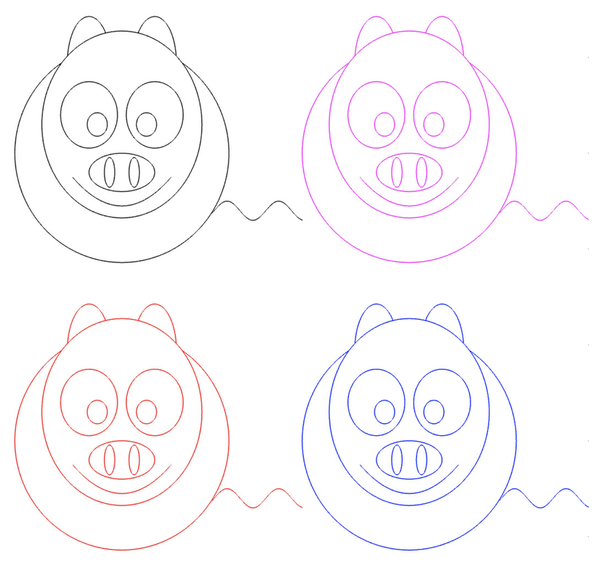 Four cute pigs to celebrate the Chinese New Year. What is the Golden Ratio?Probably, you have heard about the Golden Ratio. In a nutshell, it refers to a number roughly equal to 1.618. The number could be "seen" by drawing two lines of lengths 1 and 1.618, as shown below. 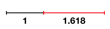 The black and red lines have lengths 1 and 1.618, respectively. And their ratio is roughly equal to the Golden Ratio. I bet you have seen many man-made or natural objects that exhibit this or a similar proportion.
That's why many people believe that the Golden Ratio is associated with beauty in our universe. Therefore, whether it is a coincidence or not, many graphic designs and artworks are created seemingly to follow the golden rule.
Estimating the Golden RatioYou may find it disappointing if I tell you that there is no way to obtain the exact numerical value of the Golden Ratio. Well, actually, the Golden Ratio is an irrational number. Simply put, an irrational number has an infinite number of digits behind the decimal point. (More formally, a number is irrational if it cannot be represented by a fraction of two integers.) For example, \(\sqrt{2}\), \(\pi\) and the exponential \(e\) are irrational numbers. Any attempt to write \(\pi\) with finite number of digits (e.g., 3.14) will result in an approximation at best. A simple method to obtain an approximation of the Golden Ratio is to use the Fibonacci sequence. The first number in the sequence is \(F_0=0\), the second is \(F_1=1\), and the third is the sum of the first two, i.e., \(F_2=F_1+F_0\). In general, a number in the Fibonacci sequence is the sum of the previous two: $$ \begin{align} F_0&=0\\ F_1&=1\\ F_n &= F_{n-1} + F_{n-2},\quad n=2,3,\ldots \end{align} $$ It is well-known that the Golden Ratio can be approximated by the ratio for a large \(n\): $$ \frac{F_n}{F_{n-1}}. $$ Our app SIMO and Console comes with a function \({\tt fibonacci}\) to calculate Fibonacci numbers. You can use the following code to approximate the Golden Ratio: And the result will be: In fact, the larger \(n\) you use, the more accurate the approximation will be. It is because the ratio \(F_n/F_{n-1}\) approaches (or converges, formally speaking) to the Golden Ratio. The convergence of \(F_n/F_{n-1}\) is evidence from the following figure: 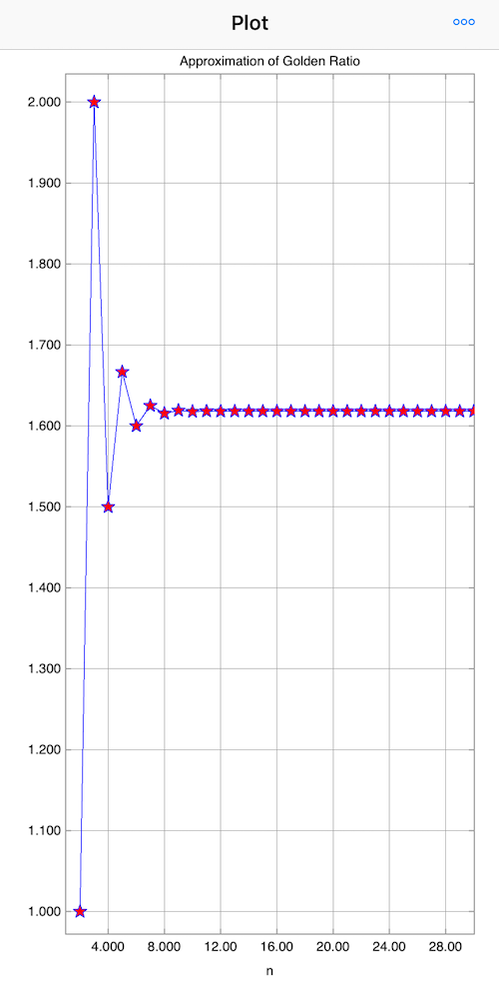 If you are interested in our posts, follow us on Twitter.
|